
The Moonflower Show
I was approached by my old college friend, Smokey-Chan, about designing a new logo for his podcast with his partner, The Moonflower Show. I graciously accepted the chance to work again with an old friend.
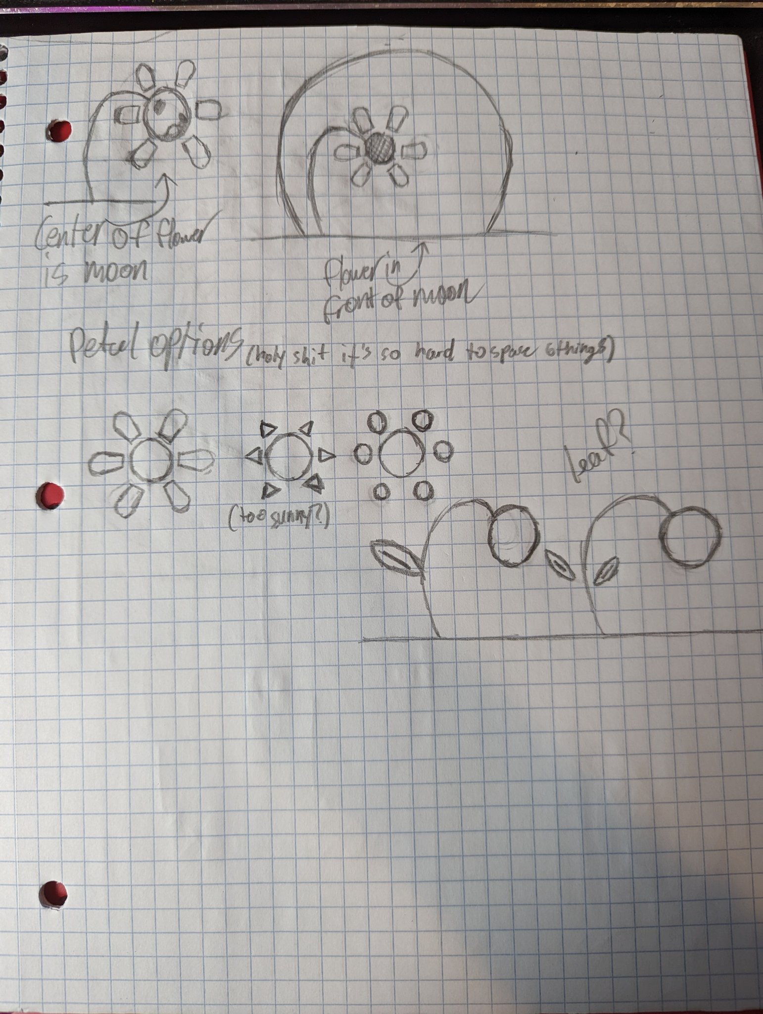
The first batch of sketches sent off to Smokey-Chan, based off nothing more than the name and a couple of vague ideas in my head. Both him and his partner liked the ideas I was throwing out, while also providing more guidance in what they were looking for, including showing me what an actual moonflower looked like (I didn't know they were real!)
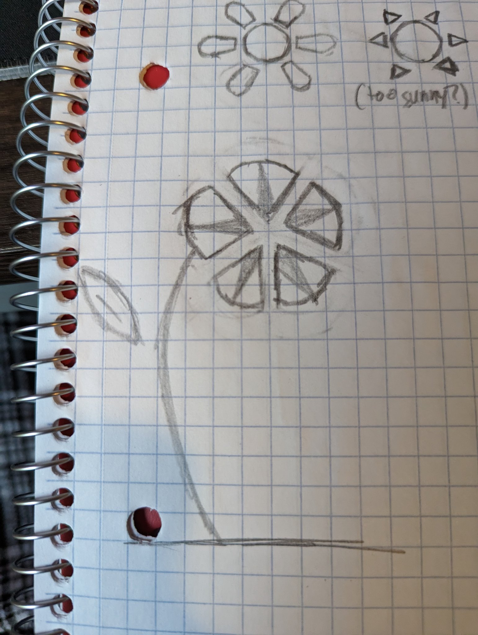
The next sketch I sent back after receiving further guidance, incorporating the ideas I had before with imagery better resembling an actual moonflower.
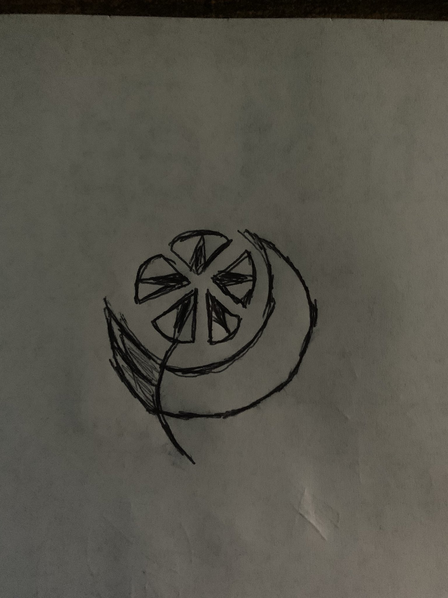
The sketch that Smokey-Chan replied to me with to get across his idea of what the logo would look like. I immediately understood his vision, and took it with me to Illustrator.

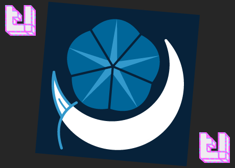
The first sketch made in Illustrator. I used various shades of blue as I was told to continue using a similar color scheme to their original logo, which was very blue heavy.
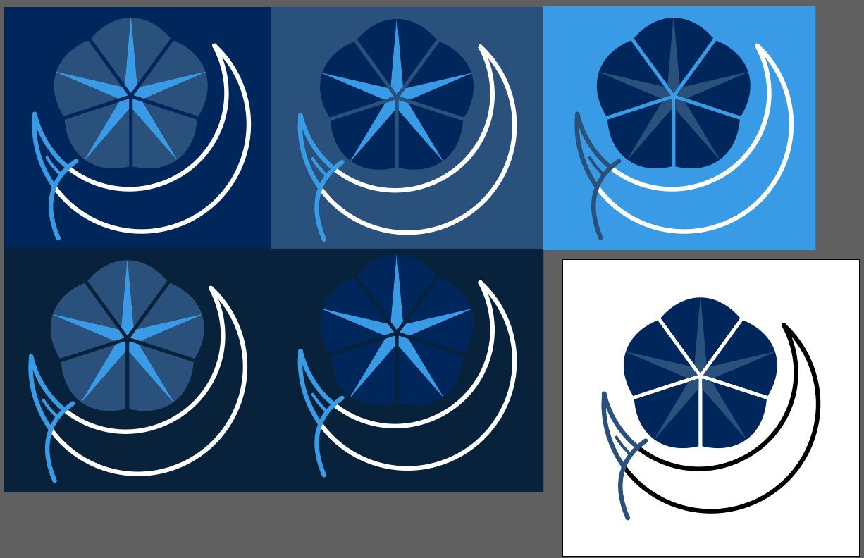
After finalizing the design, I played around with several color palettes, and sent them off to Smokey-Chan. He and his partner said their favorite was the one in the bottom left, and after a bit more tweaking of colors, on top of adding the white background to the moon and leaf, the design was finalized.


